Inspiration can be found anywhere when you’re feeling pumped-up and ready for a change – but if you live in the same building you work, it’s difficult to see anything with fresh eyes.
That’s because when we see the same things all day, every day, it becomes easy to take them for granted. Everything from your kitchen cupboards to the loyal office plant that keeps you company in the study just has the feel of yesterday’s news.
When you need a new look for your surroundings, then, you’ll benefit from looking a little harder at the design you know and love but regularly neglect. That might be the hand-me-down filing cabinet in the corner that always draws your eye. It might be the sleek curves of a neighbor’s car outside your window.
Or it might just be the font you default to when it comes to drafting a new document – or the one on your favorite website that you wish you could use!
Here’s a look at seven iconic fonts from which to draw inspiration next time you redecorate your home office.
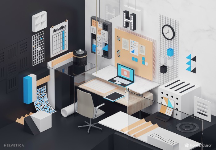
Helvetica
Developed in Switzerland in the late fifties, Helvetica has a combination of European tradition and modernist simplicity that’s made it an enduring classic.
Clean lines, straight edges, and curved details will add that touch of Helvetica to your home office space.
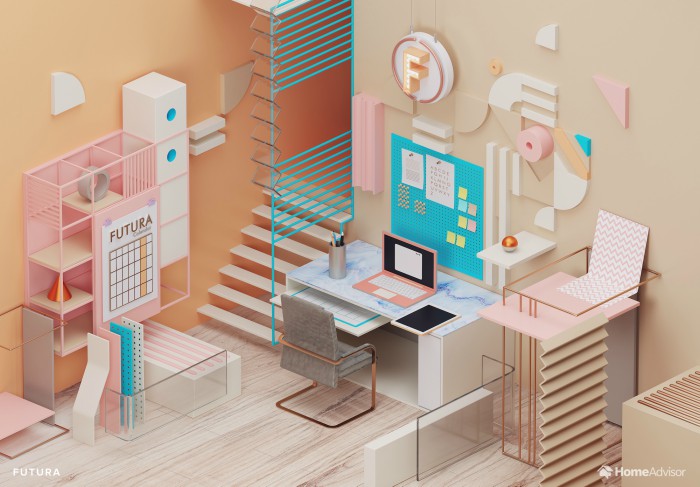
Futura
Paul Renner’s Bauhaus style may originate from the twenties, but its retro-futuristic appeal still looks fresh today.
Simple, unadorned forms and geometric detail will give your study a feel that is both fun and forward-looking.
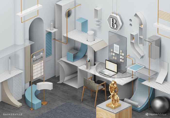
Baskerville
Baskerville’s centuries-old roots lend it a classicism and dignity that look out of place neither in your favorite novel nor the inlay card of the latest vaporwave tape
Elegant curves and timeless ornaments will give your office a sense of class and dignity which will hopefully rub off on your day-to-day work!
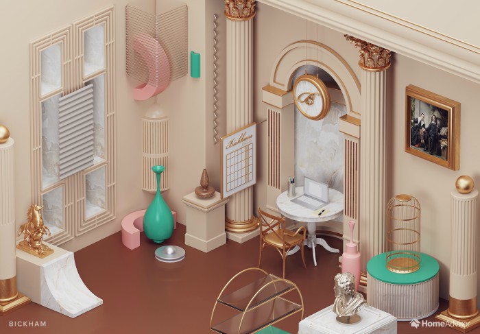
Bickham Script
Whilst hardly a household name, Bickham Script is respected in design circles for its air of calligraphy and its unassuming yet unmistakable balance.
Dramatic frills and décor so sober it borders on kitsch are the way to go to achieve the Bickham look in your workroom. A faux-marble finish will add gravity, while a gilded bird cage (containing a pot plant rather than bird, hopefully) will lend a lightness to proceedings.
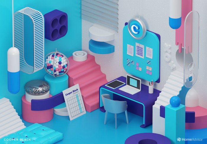
Cooper Black
Created in 1922 and hitting the big time with the advent of 1970s record cover and poster design, Cooper Black has made yet another resurgence over the past 12 months. The playful, hippyish retro-look instantly screams ‘nostalgia’, its eloquence making it a favorite for T-shirts and memes.
You’ll want some of those bold, 1970’s-inspired colors for your Cooper Black-themed home office, then – and you can match them with vintage furniture, bulbous bubble shapes, and maybe a framed LP cover or two to get that counter-culture feeling.
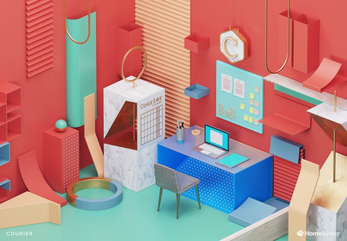
Courier
The novelists and screenwriters out there will want to make good use of IBM’s typewriter-aping Courier font – assuming they’re not sick of the sight of it in their manuscripts!
White space and earth tones will evoke a literary atmosphere, and you might want to dot those empty shelf-spaces with classic, metallic office toys and gadgets to ensure your heavy-duty work is reflected by some heavy-duty procrastination time.
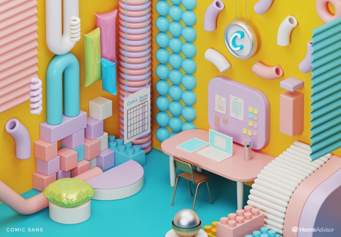
Comic Sans
Would you really consider drawing inspiration from the font that dare not speak its name?
If you’re fed-up of your office-space-so-serious, why not? A touch of kitsch, color, and playfulness can make it a lot easier to show up for work in the morning, even if you’re only travelling from the breakfast bar downstairs.
A glossy finish and plenty of ‘personality stationery’ will keep your serious zone frothy and alluring!
How will you interpret your favorite font?
Hundreds of Business Opportunities – Visit the Home Business EXPO
Find a Home-Based Business to Start-Up >>> Hundreds of Business Listings.