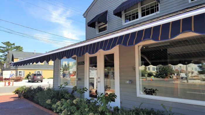
Standing out from the crowd is tricky. Whether your brick and mortar store is located on a busy plaza or small-town street, you have to be attractive enough to capture the attention of passerby who don’t necessarily know anything about the business. To survive in a very competitive market, providing a great first impression is crucial.
Consider the importance of attracting potential customers walking by your store in a high-traffic area. If you’re located among other stores in a crowded mall, and selling similar products as ten other nearby stores, what makes them come to you? Sometimes you’ve already got a loyal customer base and thrive off of it. Sometimes you’ve got great discounts. But to really capitalize on foot traffic, you have to look good. This means putting some creativity into your work. Here are some ways you can catch the wandering eyes of shoppers:
Custom Banners
Custom banners are a quick and easy way to draw people into your store. They’re cost-effective, and help deliver promotional messages in a way that potential customers understand. When you use banners, you have the power to redirect foot traffic – people who would have walked by suddenly want to know what’s going on; they’re inclined to read the message.
Custom banners come in a variety of materials, shapes, and sizes, and options are practically limitless. No matter what sort of business you own, you can find the perfect banner to match and get your message across. Think of your custom banner as a small billboard – it provides the functions of a billboard, but works even better because your potential customer is already there. You can also use your custom banner time and time again, season after season, making it a flexible option for business owners.
Window Displays
Never underestimate the power of a great window display. When done correctly, it can be a powerful addition to your overall marketing strategy. Be sure that the window display is true to your branding, but don’t be afraid to roll up your sleeves and have fun. To increase your chances of success, follow some popular tips for window display design and use this collection of examples of great window displays to help inspire you.
The best displays have a narrative: resist the urge to just throw some of your bestselling products behind the glass. If you’re having trouble coming up with a central theme, you might want to use holidays as inspiration (if applicable). Having a good focal point and lighting are central to the window display. Your focal point is what you want passerby to focus on, and lighting captures it best. Use accessories to complement the main products without overwhelming the eyes and overdoing the scene.
Appeal To The Senses
Atmosphere is everything. From the first sign of smell that greets you when you walk in, to the music and the lights, every little detail should be considered. Flirting with different senses can take you a long way.
To aid you on your mission to appeal to the senses, consider the way others stores achieve this. Stores like Hollister and Lush are known for their fragrant atmosphere. Alan Hirsch, neurological director of the Smell & Taste Treatment & Research Foundation in Chicago, is a firm believer in scent marketing, and his studies have shown that smell can be a more powerful purchase factor than all other senses combined.
The music you play in your store should also be calculated and representative of the brand. Own a surf shop? Some fun and relaxed songs reminiscent of the ocean vibe would go a long way. To help you, think about the ideal customer and the kind of music hey listen to.
Layout
The layout of your store can affect how visitors spend their money. In fact, Visual merchandising prompts people to pick up a product, and how aisles are organized and products are arranged entices shoppers to turn another corner, after they’ve already got what they came for. According to a 2002 study called “The influence of Multiple Store Environment Cues on Perceived Merchandise Value and Patronage Intentions,” poor layout can cause clients to flee a store, which ultimately reducing their overall shopping pleasure.
Find a Home-Based Business to Start-Up >>> Hundreds of Business Listings.


