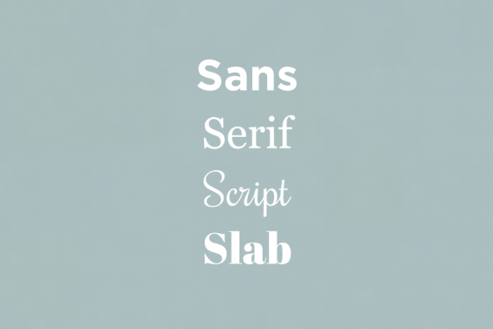
When it comes to fonts, most of us are completely lost. We don’t know their names, their differences or much less how to identify and search for a font that might be close to what we need. For starters, fonts are classified in what is called “typefaces”, which are big categories that will help us distinguish between types of fonts with different characteristics: serif, sans serif, slab and script. Inside these classifications you have different types of font, just like both a husky and a poodle are inside the “dog” category, but they are very different. The differences between them are fairly simple too: serif fonts are elegant and straightforward but a bit more ornate, with little adornments at the end of the letters called “serifs”. Sans serif doesn’t have those adornments and it is much more simple and cold. Slab uses very thick letters and strokes, and it gives off a charming, eye-catching impression. Script has a lot of round shapes and adornments and tries to imitate handwriting.
But before you go download sans serif fonts from fontsly.com to play with them, there’s a few more things you need to learn. I know the difference between serif and sans serif seems insignificant, but bear with me: it is much more important than you think. While they are very similar, they give off very different feelings, with sans serif being much more professional, straightforward and cold, and serif being much more warm, elegant and timeless. Not only that, but a lot of people prefer the readability of one over the other. Some consider sans serif much easier to read because it has similar strokes in every letter and is less ornate, while others consider serif more engaging and fun for the way the writing flows and catches the eye with different strokes. Some people even say sans serif is easier to read on a screen, while serif is better for paper. Ultimately, you will have to be the one that makes the choice of which typeface and font you would prefer to use.
However, when it comes to readability for people with dyslexia, you can find readable fonts in both typefaces. For sans serif, you have the dreaded comic sans, helvetica, open sans, or verdana, and for serif fonts you have georgia, butler, henry or andada. Again, ultimately, it is your call so do some research and decide what you are searching for when it comes to fonts.
Now you know more about fonts, how to distinguish them, and how to find out what fits your needs. Consider what business image you want to give and what sort of criteria is the most important when it comes to finding a font (timelessness, elegance, personality, readability…), choose a typeface, and go to fontsly to start browsing all the types of fonts that might fit the image you have in mind for your project. No matter if its serif or sans serif, we hope you enjoyed this article and we also hope we helped you have an easier time choosing!
Find a Home-Based Business to Start-Up >>> Hundreds of Business Listings.


