If it’s your first time designing a landing page, it’s tempting to treat it like any other webpage. However, you will soon find out that poor landing page design results in poor conversion rates.
The best performing landing pages follow certain design principles that lead to more page visits and higher conversions.
Today, we’ll explore this by looking in-depth at how to create a landing page, and review a good example to see what makes it tick. This will give you real-life insights into how to gain twice as many leads with your landing page.
Specifically, we’re going to dissect a successful landing page used by Shopify.
In June 2019 alone, Shopify had more than 57 million visits, with close to 26 million apps installed on smartphones. The platform powers more than 1 million businesses in 175 different countries, including big brands such as Nestle, Red Bull, and Pepsi.
Your business might not have the scale or business model of Shopify. Still, it could surely use the additional conversions resulting from a well-designed landing page. To leverage the full potential of Shopify platform for your business, a professional Shopify development company can ensure your landing page stands out.
Here are the elements that should be present in your landing page if you want it to be successful.
Unique Selling Proposition
A unique selling proposition usually consists of four sub-elements:
- A headline,
- A supporting headline,
- A reinforcing statement,
- And a closing argument.
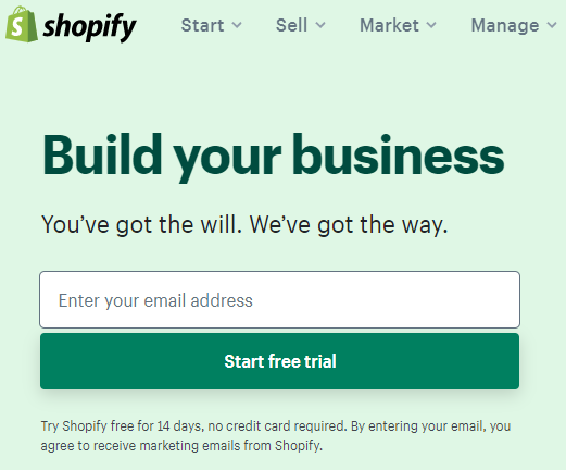
The first lines of text you see on Shopify’s landing page are short and simple. The landing page tells you what you can do on Shopify — build your business.
It also outlines how it will help you do this by providing a way for your business to have an online presence, and how you could try it. To reinforce this, they offer a 14-day free trial with no financial commitments.
In just a few lines, Shopify answers so many questions. It also gives potential users an idea of what to expect once they start their free trial.
Hero Shot
A hero shot is usually an image or video of the product in use. The best examples convey important information through visual storytelling, rather than through copy. You can use professional images, a dynamic video, or go with a creative illustration from a site such as GraphicMama.
For its landing page, Shopify used a video that showed the different types of businesses that used its online and offline platforms. They also manage to sneak in a few shots of their product in action, on both mobile and desktop.
This is crucial. Visual storytelling like this is an excellent way to convey the benefits of your product, without spelling them out verbally.

For Shopify, the messaging is clear: it supports over 1,000,000 businesses of different sizes all over the world.
These users chose Shopify because it allowed them to focus on the things that matter to them. These include renovating their warehouses, designing clothes, or hiring excellent people to work for their businesses.
The message is that Shopify takes care of the dull side of ecommerce — another great example of visual storytelling.
If you’re really curious about how Shopify looks, the landing page has a few more images.
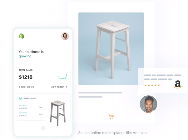
For example, the hero image above shows that Shopify works with Amazon. As anyone who’s ever engaged in ecommerce knows how important this is for creating a successful online store.
The screenshot above shows that Shopify passes the test easily.
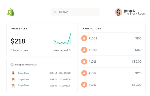
The screenshot above, in contrast, shows off Shopify’s reporting and sales recording suite, satisfying the curiosity of customers who put more weight on the platform’s technical capabilities.
It shows that Shopify does not just look good. Beneath the cute exterior lies a number-crunching, inventory-taking monster that could handle the most demanding data requests.
Benefits
At this point, hero shots and unique selling propositions have succeeded in getting your attention. But what really gets people to stay on a landing page is killer copy explaining the product benefits.
This takes all of the features illustrated in the hero images or video and explains how the potential client can use them to their advantage.
For example, Shopify lists three main benefits: selling, marketing, and managing, which are coincidentally the three tenets of its business model. Each of these is explored on its own, using a two-pillar layout.
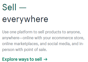
The first point is that Shopify allows its users to sell everywhere, whether it’s the seller’s own website, online platforms like Amazon or Facebook, or a brick-and-mortar store. Then it offers a way to explore selling with Spotify.
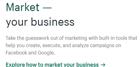
The second benefit of Shopify is that it makes marketing a business easier, thanks to its suite of built-in tools. The online marketplace is a crowded and competitive one, and merchants with access to data and the means to analyze it have a built-in advantage in terms of creating and analyzing marketing campaigns. The copy on Shopify’s landing page emphasizes the platform’s capabilities in this regard.
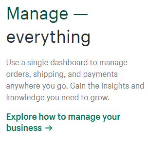
Finally, the landing page offers convenience in the form of a single dashboard. It is pretty obvious that the company did its homework and found that online merchants would rather look at just one screen.
Armed with this insight, the landing page touts the convenience and power offered by the Shopify Dashboard and invites potential users to explore managing a business with Shopify tools.
The examples above tell us that features are not enough. They have to meet a specific need or address a particular pain point. This gives would-be subscribers the extra push they need to explore the platform further.
Reviews and Testimonials
Many landing pages seem to think of testimonials and reviews as just “the icing on the cake”. However, 90% of internet users actually use reviews to help them with the decision-making process. You may think of reviews as an extension of word-of-mouth.
Not all reviews are helpful, though. Most online shoppers look at the following factors when reading reviews:
- Authority – While they seem to be more useful in online marketplaces such as Amazon, reviews written and published by credible news or trade publications have more weight than a regular review left on Yelp. If your business had its product reviewed recently by USA Today, for example, give it pride of place on your landing page.
- Recency – More recent reviews are more credible than those written a few years ago. They account for changes to the product or customer support processes that may not have been addressed by older reviews.
- Consistency – More consistent ratings and reviews are more credible since they tend to cancel out opinions that are either too positive or too negative.
Testimonials, on the other hand, are featured content that features how actual businesses or individuals benefited from a product.
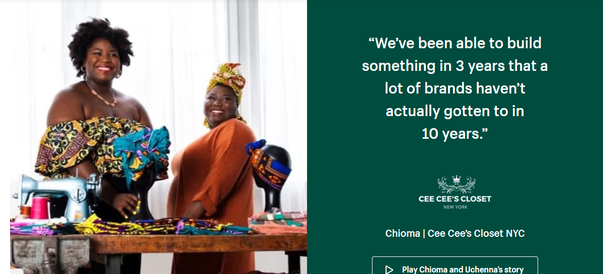
Shopify chose to feature a testimonial video from Cee Cee’s Closet, a brand that specializes in West African headwraps, prints, and other statement pieces.
Testimonials like the one featured on Shopify’s landing page have the potential to increase leads by around 67%.
Call to Action
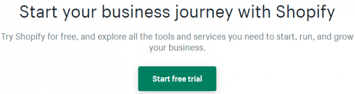
The last — and arguably most important — element on a landing page is the call to action (CTA). This is your last chance to make an impact and to convince the potential customer to at least try out your product.
A call to action button should stand out from the rest of the page. A brightly colored button like green on a plain white surface has a better chance of getting clicked compared to a button that is the same color as its background.
You can consult a color wheel to see which colors contrast each other most.
The text on your CTA button should also be short and convincing. Words like free tend to garner the most attention, followed by verbs like start. Generic phrases such as click here or submit tend to perform poorly in the ClickFunnels review.
What happens to a lead once they click on the CTA? They could be redirected to another site or be asked to fill up a form with data, including their email address.
Most leads will not make a purchase when they first visit your landing page. Instead, their email address is gathered and used to promote your other products via email marketing.
Email marketing tools like Mailchimp automate this process and free your marketing team to do other things. Mailchimp pricing ranges from a free starter account for up to 2,000 subscribers to “Pro” plans that start at $199 per month.
How to Design a Landing Page That Generates Twice the Leads
To get the maximum number of sales leads from your landing page, it must be redesigned in a way that follows the way the human mind processes sales pitches. Getting page views is just the start of the journey. Convincing page visitors to stay and subscribe is another story.
The written content of the landing page is just as important as its appearance. It should always appeal to human emotions and answer the question, “What’s in it for me?” Once you’ve answered the question, you’re already halfway towards a conversion.
You should also consider common landing page mistakes. Chief among these is trying to sell straight away, rather than using landing pages to gather and nurture leads. Instead, you should use your landing pages as entry points into your mailing list.
Following the best practices identified in this article, your landing page conversions can easily double.
Find a Home-Based Business to Start-Up >>> Hundreds of Business Listings.