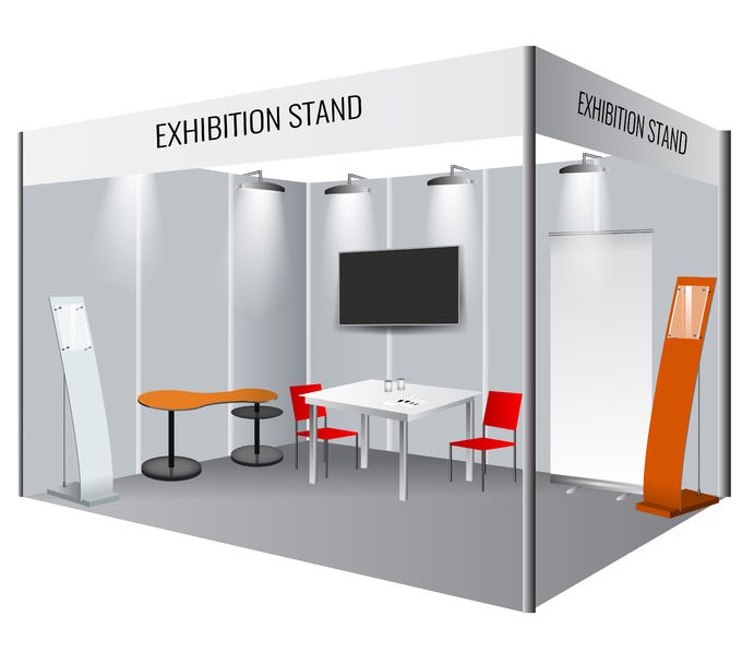
Can you really have your cake and eat it too as an exhibitor? After all, you want to do the very best job possible and have an amazing looking stand that will reflect your brand in its best light. But can you do all of it with a small budget?
Looking at larger, aspirational stands can leave you wanting everything when it comes to what to put on your stand, but wanting everything often comes at a cost.
Here are a few tricks that you can use to create an amazing looking stand that won’t blow your budget:
Quality over quantity
You could choose to use the cheapest displays in order to have more, but do you really want to be left with a one trick pony that breaks after being used a couple of times? Probably not. It’s best to do a bit of research to choose exhibition stands with graphics that won’t curl or peel over time and that can provide guarantees to work more than once! If it sounds too good to be true, the chances are it probably is when it comes to displays.
Using fewer, but better quality, displays will leave your brand standing tall.
Think about what you need as a priority
Before even thinking about the design of your stand, you’ll first need to consider how it’ll need to work. What do you want people to do on your stand? Do you want them to browse your products to purchase then and there? Do you want to show examples of the work you do? Do you need a surface to write down lead information to get in contact later?
The answers to these questions will determine the sort of displays you’ll need from a functional perspective. The amount of space you have available will then determine how big these could be as well as how much room you have remaining for your other displays.
Longevity of your design
To maximise the use of your displays, choose a very simple design that reflects your brand that could be used time and time again. This maximises your potential ROI as it means that you won’t need to purchase more stands for your next show.
Choose simplicity with your logo at the top, a simple strap line to tell people what you do (and why they should stop by your stand) using brand colours and a sharp image.
Keep text to a minimum
As you’re excited about your business, it can be tempting to put everything on your display, but when it comes to text, less is most definitely more. Of course, the amount of text you have shouldn’t affect the overall cost, but it’s a tip that won’t cost you a penny!
Keep any text to simple bullet points that can be read with a passing glance. Your displays after all should be there to add branding, to attract attention and draw people in to speak to you – it’s then up to you to do the talking, not for your visitors to do the reading.
Find a Home-Based Business to Start-Up >>> Hundreds of Business Listings.


