A professional logo serves as a company’s emblem which has to be given the same kind of love and care as a mother gives to her child – they must be nurtured and raised to be appreciated and loved by society. Furthermore, a logo has to be unique, appealing and memorable in the minds of the audience that your brand is targeting.
Unfortunately, designing a professional logo can be tricky and challenging at best, especially if you’re a startup logo design company with barely any credible experience. If left unchecked, you could not only end up with a sloppy logo but also something that could hamper your brand’s image in the long run.
Therefore, if you wish to acquire a quality logo design, then we urge you to steer yourselves away from 12 of the most common logo design no-no’s:
1. Typography Flaws

One of the most important keys to a powerful logo design is simplicity, which is what you must keep in mind when considering typography. You have to make sure that the logo is readable from all angles including its font, typeface, character spacing, tracking and kerning among others.
In being mindful of the logo design no-no’s, you have to be especially cautious when selecting a particular font style. Choosing a font with characters are too close to one another or of varying sizes is detrimental to a logo’s overall appeal.
Therefore, designers must conduct a thorough online research about the most popular types of fonts and ensure that their ideal font is balanced in every aspect. If you want great fonts, then we recommend popular tools such as Fontface Ninja, Find Great Google Fonts or Calligraphr.
Using more than two or three fonts is another fatal blow to your logo design. It only makes your logo look muddled and confusing. At best, you can use two fonts, but sticking to just one font is more than enough for your viewers and it gets the message across.
2. Logo Design No-No’s: Making Use of Raster Graphics

For those who don’t know, raster graphics can make images appear pixelated, blurry or blocky. If you were to scale an image created with raster graphics, it would only confuse the viewer.
Instead, you should get into the habit of designing your logos using vector graphics. Unlike raster, vector graphics can be scalable at any size and are able to retain an image’s perfect quality. Some of the most popular tools that allow you to create logos with vector graphics are Abode Illustrator and CorelDRAW. You can also try an online logo maker like Logopony which uses vector graphics in their logo designs.
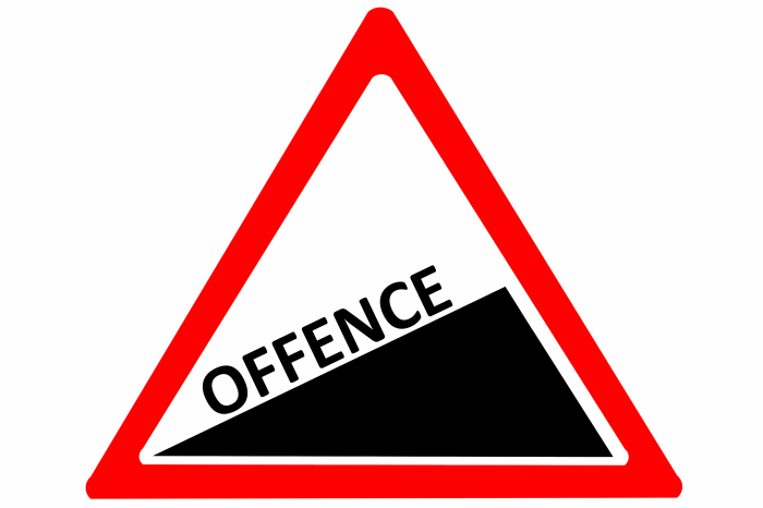
3. Stealing Someone Else’s Logo
 Stealing someone else’s years of hard work and passing it off as your own is quite possibly one of the lowest forms of a felony anywhere. Anyone who does this only undermines their own creative potential which comes off as lazy and disrespectful to the audience. This especially applies to logo designing.
Focus on your own concepts even if they don’t turn out to be attractive at first. Also make sure that in the end, your own logo does not resemble your competitor’s in any way possible. Ensure that your logo is as original and appealing as possible.
4. Depending Too Much on Trends

While it is nice to incorporate elements of the latest trends into one’s logo designs, it usually doesn’t work well in the end. The thing with trends is that they come around only for a short while and then they go away. For instance, a winter-themed logo will hardly gain anyone’s interest during the summer season.
McDonald’s, Coca-Cola, Nike and Google are examples of brands with simplistic logo designs that haven’t changed in years or even decades.
Hence, you too should focus on designing a logo that is unique, has a minimalist design and something that your audience can recall for years and decades to come.
5. Saving Your Design in The Wrong Format

There are plenty of design software programs and tools that allow you to save in various formats such as JPG, TIFF and more. But knowing which format is the best for the logo largely depends on the client’s requirements for the design and whether it needs to be printed or displayed online. Always communicate closely with your client(s) to avoid undesirable results.
6. Designing Immediately Without Proper Planning

To reiterate, designing a professional logo is challenging. This means that you could be working for hours and be making plenty of mistakes in the process. But in the end, your hard work will pay off.
Avoid making snap decisions. Instead, take the time to research plenty of the most popular designs, explore logo libraries such as DepositPhotos vector collection or iStock and get in touch with other designers to determine their inspirations so that it can give you some great insights for your own design.
7. Using Complex Details

Some designers have it set in their minds that adding too many details will enhance a logo’s charm when in reality it does not. A logo design has to entertain simplicity to appease your target audience. Frankly speaking, don’t stuff a logo with additional details and features with pictures of people, animals and trees. This will make it difficult for the viewer to understand a logo’s actual purpose.
Popular brands such as Microsoft Windows, Apple and Nike are great examples as they have logos that are simple and memorable in design.
8. Not Making Logos Responsive on Digital Devices

Nowadays, most people from around the world are increasingly making online purchases. Therefore, it is crucial to maintain a strong online presence on various digital devices such as computers, tablets and smartphones. This means your logo design has to be responsive on every digital device, by which we mean that it has to be scalable at any size and deliver the same message as with brick-and-mortar stores. This way, your brand’s visibility will be improved.
9. Avoiding the Client’s Requirements

This is by far the biggest mistake that you must avoid making no matter what. If your client does not get the logo that they are expecting in the end, then they won’t pay you and your reputation is scarred. It is pivotal for you to meet each and every one of your client’s requirements.
Some logo designers even make the mistake of including a trademark in their designs. Although you have the right to be proud of your work, you must never try to impose your personality into a design. Only focus on what the client wants at the end of the day.
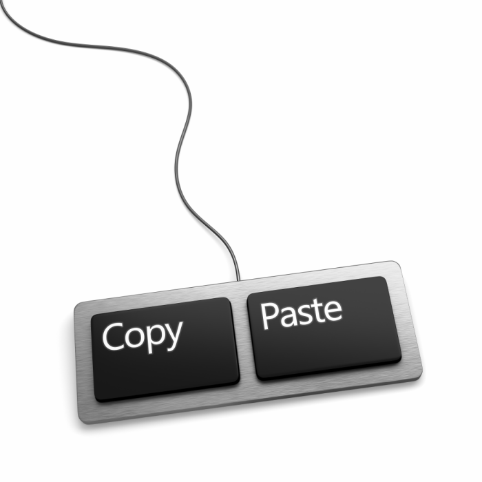
10. Overly Relying on Stock Imagery

Another unnecessary shortcut that some logo designers take is by downloading clipart from stock imagery websites such as VectorStock. This is an uncreative and lazy approach that does not befit the role of a professional logo designer. Clipart does nothing to portray the actual message of your brand.
If pulling images directly from online image galleries and sites is all that it takes to be a professional logo designer, then everyone would be logo designers by default – which is wrong on so many levels.
11. Using Inappropriate Words and Shapes
 You’ve probably come across a number of logos that have a double meaning to them especially when you pay close attention to their words, shapes or forms. An example of such includes the Airbnb logo which raised a lot of eyebrows as the icon was criticized for resembling sexual organs. It’s good to be creative with what you design, but you also must be careful of how people perceive it both verbally and visually.
12. Forgetting to Proofread
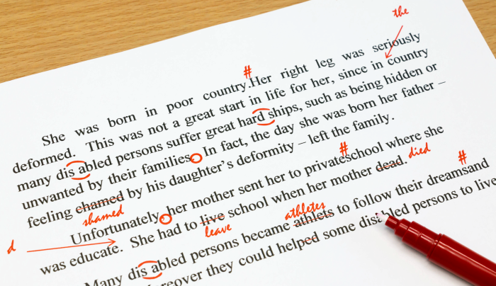
It is vital to ensure that you go through your logo designs over again so that nothing is out of place, including the spelling. It would be really embarrassing for a startup brand to botch their inauguration with a misspelled logo. Exercise patience and always revise your designs to avoid such mishaps.
Conclusion
Now do you see how delicate and precise you have to be in designing a professional logo? Everything from the typography, to the fonts and meeting the clients’ needs have to be accounted for or your brand will fail to make an impact. If there are other points that I have not touched upon, don’t hesitate to let me know in the comments below.
Find a Home-Based Business to Start-Up >>> Hundreds of Business Listings.