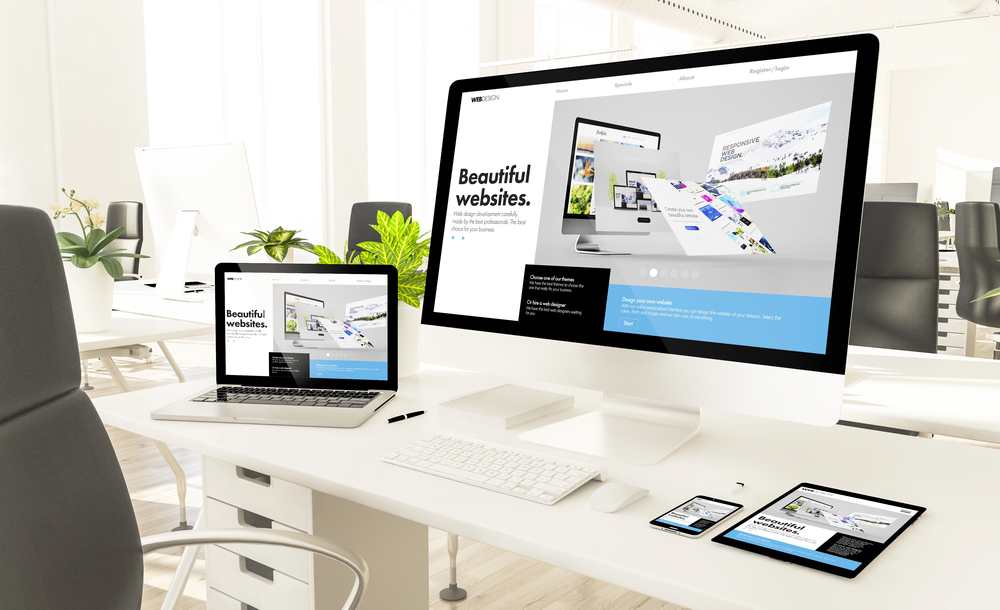
Whether you have had the same layout and content for years and think it’s probably time for a redesign, or simply don’t have a Web presence as yet, you should consider making a new website for your business a top priority in 2016. If you’re worried about how to create the best possible layout and functionality though, it pays to do your research. Read on for some top design tips to consider today that will help ensure your online presence achieves excellent results in the future.
Employ Useful Navigation
One of the most important elements of website design to consider is the way that your site will be set up for viewers to navigate it. If you want your site to keep readers browsing for as long as possible and completing actions such as making a purchase, getting in contact, or booking a consultation, you need to ensure that your design employs what’s known as “intuitive” navigation. Essentially this means that people can easily find what they’re looking throughout the site, and don’t click away because they can’t figure out where to go next or how to locate the information they’re after.
When designing your website, remember to put links to the most important pages up the top where they can be easily seen. Similarly, less important information and links should go at the bottom of the site in the footer so that they don’t distract potential customers from the primary data or calls to action.
Avoid Clutter
Another way to design a site that works is to ensure that the layout isn’t cluttered. People can be easily overloaded visually when they’re looking at websites which bombard them with images and too much data to take in. This typically makes them click away in a hurry because the site just becomes too hard to look at or the material too difficult to digest.
To avoid this happening, your website should not have too many graphics such as photos, animated gifts, slideshows, and the like. Text should also be broken up into short paragraphs that visitors can easily skim through to find the information they need. As well, avoid having competing calls to action on the one page (such as newsletter sign-ups, add-to-cart buttons, and contact forms); and try to limit the majority of links to the header or footer of the page.
When considering your website design, keep the concept of “white space” in your mind. This refers to the blank areas between text and images that gives visitors space to breathe and take in the various features of the website without becoming overwhelmed.
 Use Color and Fonts Wisely
In the same way, it’s also imperative that you carefully select the colors and fonts that you use on your website so that people don’t have to struggle to read the screen or get faced with garish shades that strain their eyes.
Color should be used strategically throughout a website, with small bits here and there such as in text headings, headers and footers, and in graphics. The rest of the site typically should be in a white or light-colored palette that is quite neutral. In addition, don’t forget to utilize hues that match your logo and other branding material so that it’s clear that the website is operated by the same company.
When it comes to fonts, again these should be easy to read at all times. Test your chosen font on multiple devices and browsers though, since website visitors may use a wide variety of options to peruse your site. Keep in mind that fonts can look different on different screens or formats, so it’s best to choose a universal option.
Typeface should also be large enough that viewers can read it without having to squint or get close to the screen — usually the size should be set at 11-point or higher. Furthermore, don’t use lots of different fonts throughout the website as this just adds visual clutter and doesn’t provide consistency.
Find a Home-Based Business to Start-Up >>> Hundreds of Business Listings.


