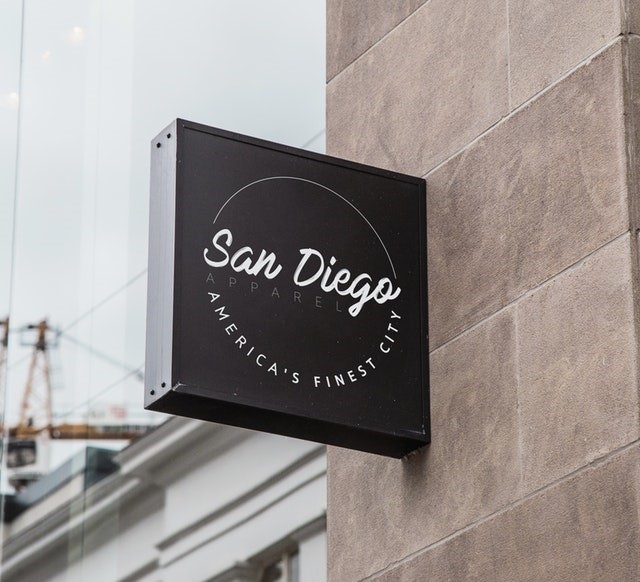
The name of your startup is an essential element of its logo. As such, the importance of selecting a font for the logo must never be underestimated.
The appropriate font allows the logo to showcase the advantages of choosing your brand, and the opposite is guaranteed to undermine trust and evoke some pretty nasty (if not funny) associations.
As there are so many font options to choose from, you might end up spending a lot of time in the selection process. To make things easier on your end, here are some important things to know about choosing a typeface.
List of Major Font Types
- Serif Fonts – Feature serifs or vertical lines at the end of every stroke. They evoke respect and reverence for tradition, comfort, and reliability. Some examples include Baskerville, Times New Roman, and Trajan.
- Sans Serif Fonts – These font types do not feature serifs and, as such, are more modern in appearance. They channel novelty, neatness, and aspiration. Some examples include Calibri, Franklin Gothic, and Helvetica Bold.
- Script Fonts – Look as if they were handwritten. They evoke elegance and tenderness. Lavanderia, Bickham Script, and Edwardian Script are some examples of this font type.
- Modern Fonts – New-style fonts which stand for progress, style, decisiveness, and elegance. Two examples of this type of font are ITC Avant Carde Extra Light and Futura.
- Display Fonts – Not often used on logos due to their peculiar appearances, but are still a good option since they evoke uniqueness, friendliness, playfulness, and emotional richness. Some examples include Valencia, Giddyup, and Cooper.
The font selection process is as follows:
- Keep things simple. A logo that has a clean-looking font is easier to enlarge and/or minimise. A logo that can be enlarged or minimised easily can easily be reproduced across marketing materials like Takeaway Coffee Cups, posters, and web assets (website and social media accounts).
- Mind the fonts the competition is using. The goal of this step is not knowing what you should do, but rather, the analysis of whether the competition made the correct choice of font or not. When you analyse, bring the list of font types above with you. See if the fonts they used for their logos are in line with the personalities or identities of their brands.
- Use a font that reflects the personality or identity of your brand. Once you’ve done the above, the next thing to do is to determine the font that best suits your company. That said, you should determine your brand’s personality if you haven’t done so already.
To determine the personality of your brand, you need full knowledge of the kind of startup that are you establishing and the audience you wish to deal with.
To determine the personality of your brand, you need full knowledge of the kind of startup that are you establishing and the audience you wish to deal with. If you are establishing a law firm, it’s best to use a typeface that looks very serious. For a bridal supplies shop, on the other hand, however, a script font can be used, as it evokes a sense of elegance and class.
If you are looking to use two fonts, make sure that they have limited use.
- Avoid using a lot of fonts on your logo. Choose only one (or two, at most) fonts to use for your startup’s logo. Using way too many fonts makes your logo ugly and difficult to reproduce. Worse, it could cause potential clients to distrust you.
If you are looking to use two fonts, make sure that they have limited use. How do you ensure that their use is actually limited? Their use should only be limited to advertising purposes (to emphasise a point) or in the logo of a sub-brand you own.
- Avoid using trendy fonts. While trendy fonts are an option for you, they are best avoided since they might not be popular in the next two months. Worse, their use could cause others to perceive your company as a people-pleasing company.
Conclusion and other things to be aware of
Once you’ve chosen a font to use for your startup’s logo, it’s time to think about case, scaling, and spacing. Case refers to capitalisation, scaling refers to the width of each letter, and spacing refers to the gap between letters. There is no hard and fast rule on determining the correct case, scaling, and spacing except one—all three elements need to be able to bring your message across all audiences as well as your chosen font.
Find a Home-Based Business to Start-Up >>> Hundreds of Business Listings.


