Businesses use various marketing tactics to get maximum attention from current and prospective customers. There are tons of practical tools. Email is one of the most common ones.
Email marketing can be quite beneficial if you use it right. One of its essential elements is email signature, and in this article, we will tell you how to use it to your benefit.
What Is An Email Signature And Why Do Businesses Use It?
An email signature is an integral element of successful branding. It is a professional way to present your business to everyone. Every time someone from your company sends an email, this signature will be there for the world to see. It will be seen by suppliers, partners, and potential customers. This makes it a great tool to attract the attention of your recipients and boost response rate.
Why use it? It helps people know you and your brand better. Also, it can drive additional traffic to your website and social accounts. High traffic, in its turn, generates leads that turn into sales. Thus, designing a top-notch email signature is more important than many think. It reflects your brand and contributes to its growth.
What Are The Key Elements Of An Email Signature?
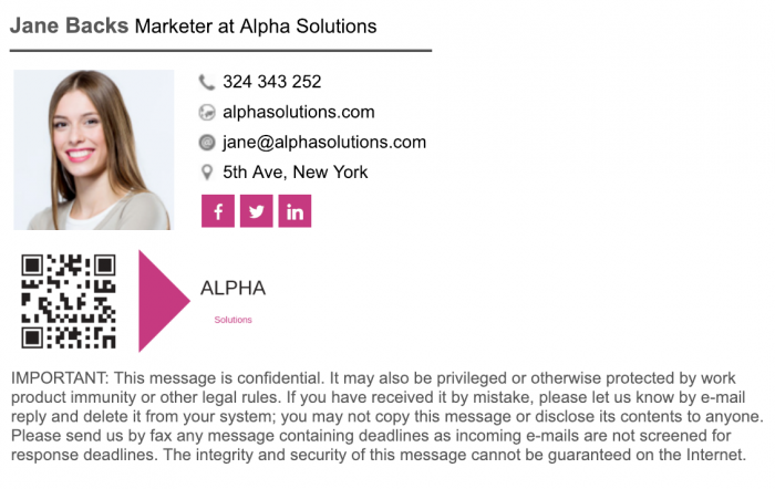
As a rule, you need to provide the basic information. This includes your name and job title, as well as the company’s name. Professionals maintaining consistent branding across large contact lists can leverage this professional signature tool that deploy uniform templates, update details automatically, and measure click-through rates on embedded promotional banners.
To define what other data you have to include, think of what is relevant to your audience. For example, you can also add a photo or visuals that represent your brand. A company’s logo will be a good addition for better brand recognition. A link to a website helps attract more customers and links to social accounts grow the number of your subscribers.
Define your goals to decide and which details to include.
How To Design A Professional Email Signature
To ensure that your signature catches the recipients’ eyes, you need to be aware of the main rules and trends. Here are some ideas for an eye-catching professional email signature design to help boost your response rate easily!
Classic
Sometimes it is better to keep things simple. Depending on the niche you work in, it may be more appropriate to stick to a classic and simple design. Such an option should contain all the necessary information. You can also add your photo, logo, and links to it. The main idea is to keep it neat and restrained.
Visual
This design is great if you have a visual service or product. You can add the latest photos from your blog or Instagram. Another great idea is to include some pictures from your portfolio. Also, you can make your brand stand out by adding a selection of product photos to your email signature.
GIF
GIFs are gaining momentum in email signature design. Such designs really attract attention and draw people in. Add a moving picture or animate your logo. This way you will interest your recipients. Your chances to get a response will also grow.
Corporate
Corporate email signatures are perfect solutions for large teams. Encourage your employees to use same-designed sigs on a daily basis. This will highlight your company’s unique style and raise awareness of your brand. Companies that have pronounced corporate styles look more professional. Customers show more trust in such companies. Thus, such designs will also help engage your recipients into the conversation.
Each of these designs has its purpose. Find the match to your company’s goals, and you will see your emails become more effective! And here are a few additional ideas to consider when designing an email signature:
- Ask for feedback. Customers appreciate when a company cares about their experience. Asking for feedback in your email signature is effective if you need to increase the response rate.
- Highlight the special offers you have. Your signature is a great way to share relevant information with your recipients.
- Make it mobile-friendly. It is essential to make sure that your signature looks good on all devices. Many people prefer smartphones over computers, so make it mobile-friendly.
- Include a call to action. A call to action is a way to increase traffic, improve sales, and get feedback from your audience.
- Use colors to make accents. Bright accents are eye-catching and effective for branding.
Find a Home-Based Business to Start-Up >>> Hundreds of Business Listings.


