Working on an all-important business presentation? If so, you’ll know that there is a lot that could go wrong, from illegible typefaces, low-res images, and cluttered slides sure to leave your audience confused. The solution? Make sure you hold off the presentation until you’ve checked every point on our handy cheat sheet.
Be sure to bookmark this page, as it will come in handy each and every time you need to create a business presentation. Our list is comprehensive and includes everything that you should include (and a few things you really shouldn’t) to ensure your presentation suitably wows your audience and effectively conveys your message.
Okay, let’s start with tips on…
Presentation design
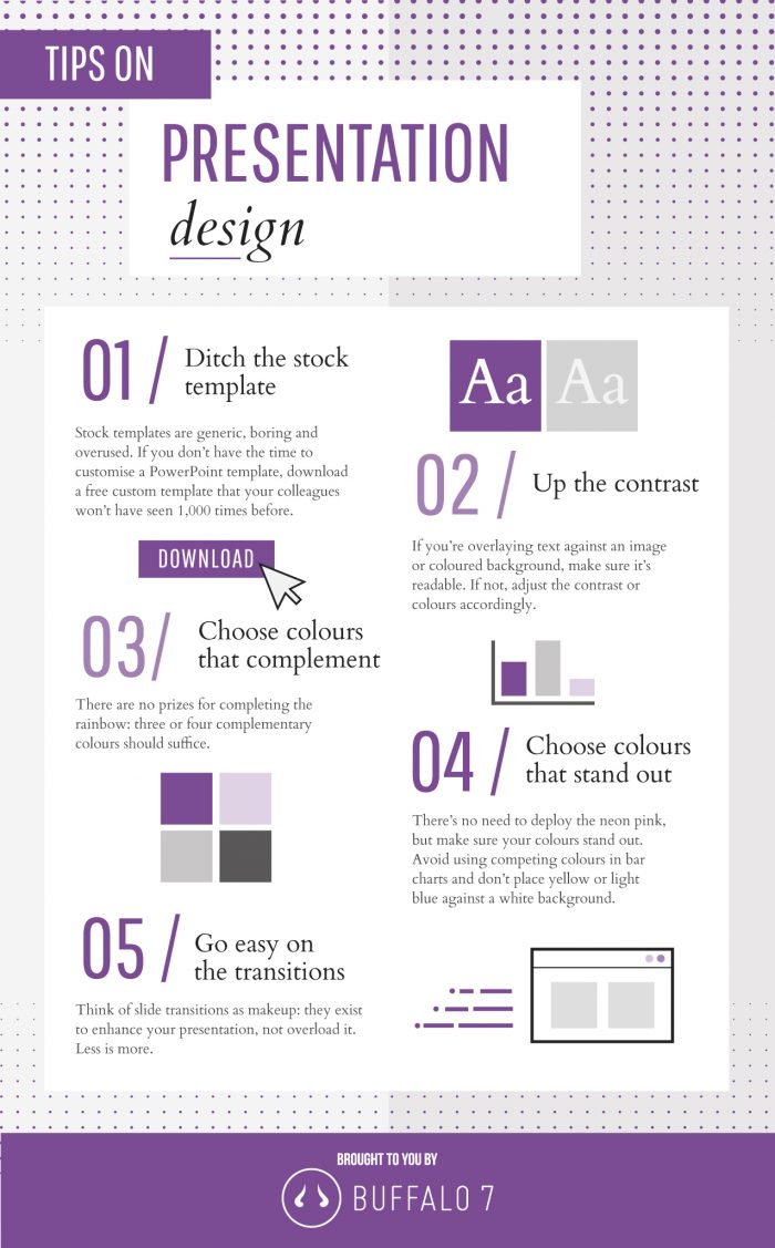
As with many presentation programmes, it might be tempting to use one of the stock templates as a start – after all, that seems like the quickest way to begin, right? However, think about the number of times your audience has seen the basic, boring, uninteresting stock PowerPoint template.
Give them something new and eye-catching by starting with a custom template; either one you’ve designed yourself (it’s easier than you think), or a free one you’ve downloaded from the internet. Do that, and you’re already ahead of the competition.
After that, be sure to think about your main colour palette. Three or four colours that complement each other should be enough to give the presentation a uniform feel and be sure to pick ones that stand-out. Just be sure your chosen colours can be clearly seen, as the likes of yellow and light blue on a white background can often be lost.
Make sure that any text you overlay onto those colourful backgrounds can still be seen. If not, adjust the contrast or colours to fix it.
Go easy on those fancy transitions. Just like make-up, transitions should enhance what is already there, not steal all the attention and distract your audience.
Choosing text for your presentation
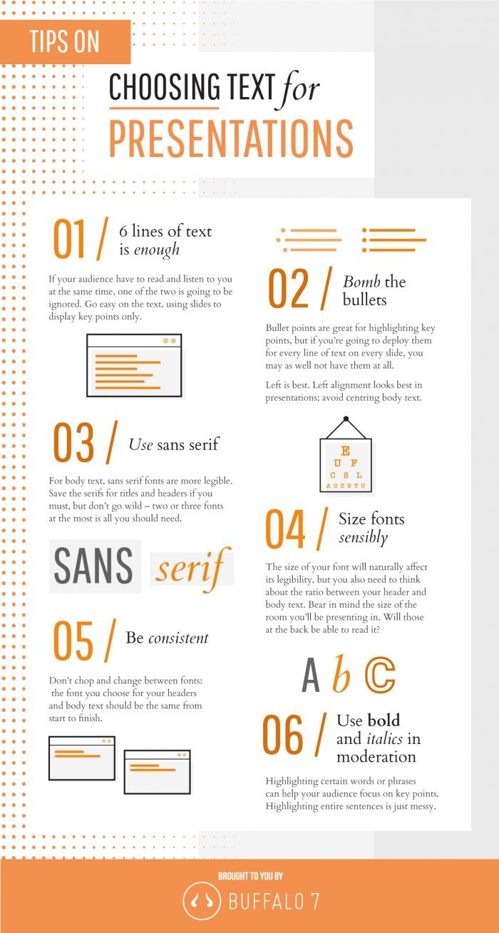
Remember: if your audience has to spend time reading something, they’re not going to be listening to you. Therefore, keep lines of text to no more than six in number on any one slide. If you need to say more, use the next slide to continue your message.
Be sure to watch those bullet points when typing up the words; if you find you’re using one for each and every line of text, you probably don’t need them at all. Ditch them and keep the slide looking clean.
Sans serif fonts are always easier to read but be sure to keep the total number of fonts you use in the presentation to no more than two or three – perhaps use one for your headers and titles, and the other for the main body of text.
Just like your colours, make sure your font use is consistent and uniformed and be sure to take into consideration the size of your presentation space and audience: does the text need to be bigger, so it can be clearly read?
Using bold and italics can be a great way of highlighting key points and phrases but be sure to go easy on it; a whole sentence in italics can look messy and go against your presentation’s consistency.
Choosing images for your presentation
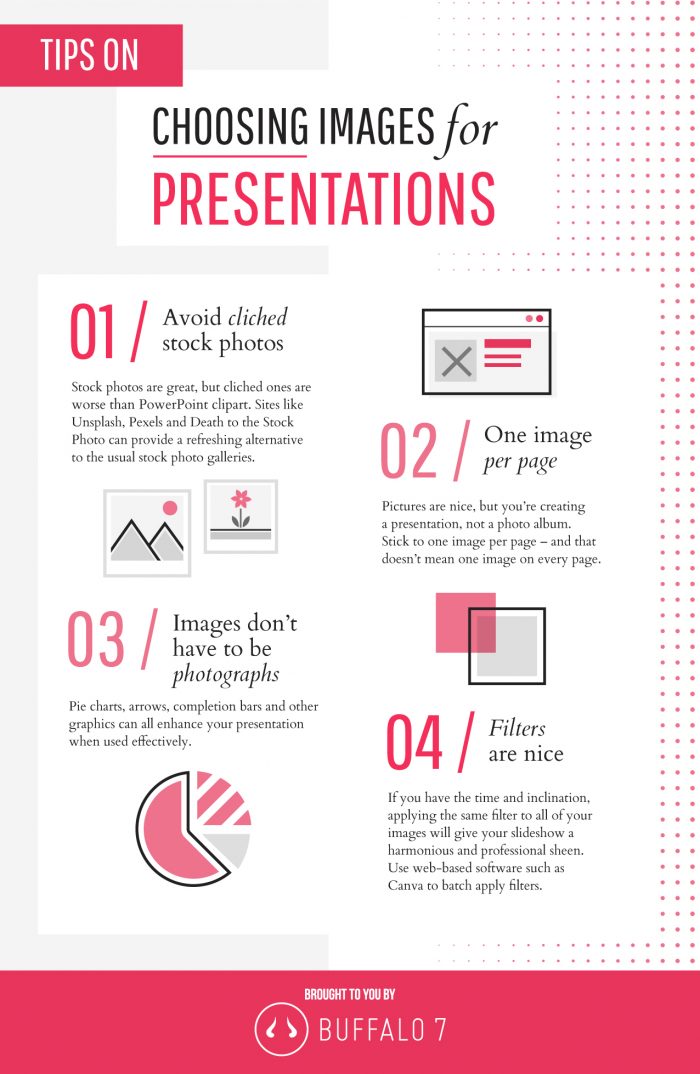
Just like your choice of template, be sure to use images that your audience might never have seen. The standard stock images that you might find on your computer will have been used over and over again and are as cliched as Clipart. Check sites like Pexels, Death to the Stock Photo, and Unsplash for refreshing alternatives.
Once you find some great images, be sure not to go crazy. Just one image per slide should be enough, but that doesn’t mean that every slide needs an image. Graphics, such as well-designed charts and graphs, will also add a lot of visual interest.
If you have the time, adding the same filter to all your images will create a fun and harmonious feel, as well making you look a tad more professional and creative. Web-based software like Canva can add filters to your images by the batch. Try it.
General presentation tips
Keep it simple, stupid.
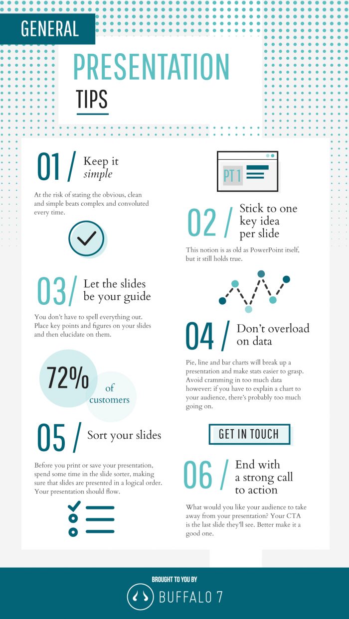
Sounds obvious, but the simpler your presentation, the better and more effectively your message will be conveyed. Ideally you should have one key idea for each slide, eliminating the need to make an awkward transition while you’re talking about something important; you’ll risk losing your audience’s focus.
Use each slide as a guide – a memory aid – that allows you to elaborate on a key point. After all, you’re one making the presentation, not your laptop.
On that note, be sure that your slides are in a logical order and follow the flow of your presentation. If your topics and slides don’t seem to gel together, consider revising their order.
Finally, consider what you want to leave your audience with once your presentation is over. What do you want from them? Your final slide should be your Call to Action so make sure it is strong, bold and clear.
Now get it done!
A lot of that might seem obvious, but in creating that make-it-or-break-it presentation a lot can be accidentally overlooked.
Keep this cheat sheet handy as it could prove to be the difference between you giving a great presentation and an amazing one.
Find a Home-Based Business to Start-Up >>> Hundreds of Business Listings.


