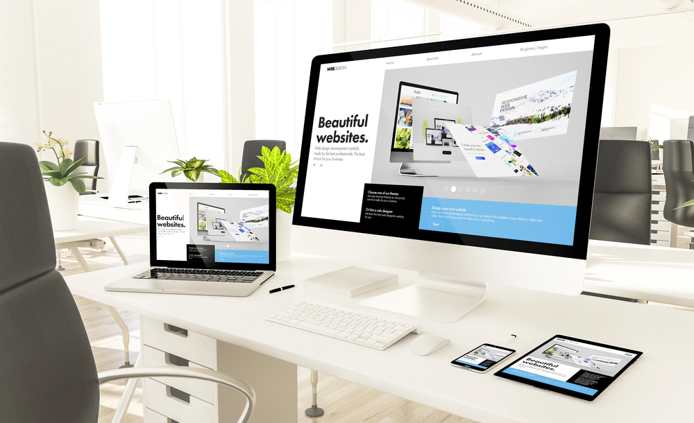
You cannot start up a new home-based business in today’s environment without a web site. A first check on credibility by any potential client is to check out a business’s web site. A web site is also where initial information is gathered on a business.
Building a basic web presence has never been easier. Tools and software are available that guide even the most basic novice through the process. All you need to get started is a basic web site. As your business grows and changes, you will need to adapt your web site, and that will likely require some professional help.
Plan out your web site by laying out your basic information channels (About Us, Services Provided, FAQs, Testimonials, Contact Us, etc.). Select a software program, and tinker with the basic templates that come preloaded with the software. Use trial and error.
Designing your own web site can save you money, but only if the results are professional. Here are 10 great tips to stop your web site from looking like it was designed by a “newbie.”
1. Purchase A Domain Name.
Trying to create a professional image with a web site hanging off someone else’s domain is counterproductive. Domain names can be purchased for as little as $9 per year and web site hosting starts as low as $4 per month. Try www.GoDaddy.com for some great deals.
2. Utilize The E-Mail Address That Comes With Your Domain. Nothing marks you as an amateur more quickly than using a free e-mail address for your business. Domain e-mails can automatically forward to the e-mail address of your choice, but your web site visitors don’t need to know that.
3. Include Your Web Site And E-Mail Address On Every Piece Of Advertising That Walks Out Your Door.
Don’t forget to capitalize the interior words of your web site address. www.BobsConcreteCompany.com is easier to read and remember, making your customers more likely to visit it. Most people won’t type the capital letters into their browser, but even if they do it won’t affect their ability to get to your web site.
4. Lose The Pea-Green Background.
When it comes to the actual design of your web site, resist the urge to use a rainbow of colors. Keep your web site clean, crisp, and professional. White or cream backgrounds work best. Aim for consistency in the color scheme and punch up your web site with pictures and logos, not background colors. One of the few exceptions to this rule is in marketing to customers with visual impairment. Choosing high contrast colors and large text will aid them in navigating your web site.
5. Mute The Sound.
Professional web sites do not have midi files or sound effects playing in the background. Movies or audio files that are pertinent to your business are acceptable, but stay away from the gratuitous use of sound. Encourage web site visitors to fully explore your site by not irritating them with repetitive sound effects.
6. Use Tables for A Well Balanced Web Site.
Create columns to line up pictures and text, or merge cells in a table to create headers that span the entire page. Use transparent line borders to give your web site a clean professional look. Don’t forget the white space. Crowded web site pages filled with long blocks of text don’t get read. Adding white space to your text allows the reader’s eye a place to rest, and encourages visitors to read what you have to say.
7. Use Colorful Logos, Banners, And Buttons To Add Interest.
Search the Internet for royalty-free no-cost photos for your web site. Use a photo-editing program to add text to pictures and create your own logo. You can find a free one at www.DownLoad.com (search for free photo editor). Don’t forget to reduce your logos to a manageable size.
8. Give Your Web Site Consistency.
Every page should have your company logo, mailing address, e-mail address, phone number, and the navigation buttons of your web site. Shared Borders makes this easy to do, and it will automatically apply changes to each page of your web site.
9. Make Your Logo A Hyperlink.
Have your main logo redirect back to your homepage. It only takes a moment, but it gives your customers an easy method of returning to the beginning of your web site.*
10. Open External Links In A New Window.
Anytime you are navigating a customer away from your page, do it in a new window. You don’t want to lose the customer to another web site. Give them an easy way to get back to you by keeping your web site open in the background.
Find a Home-Based Business to Start-Up >>> Hundreds of Business Listings.


