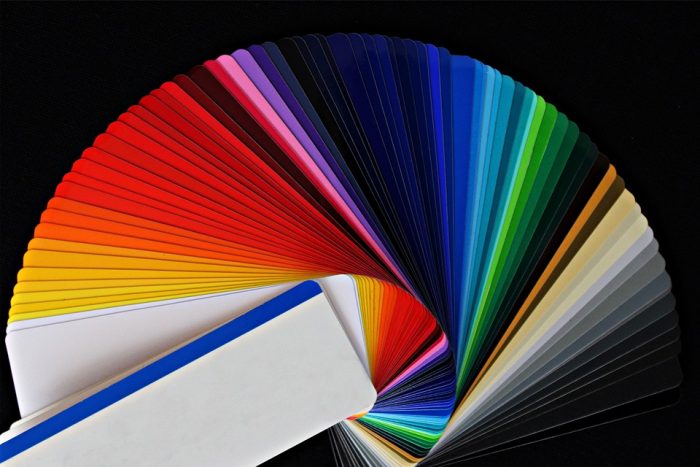
In the field of marketing, advertising is used with the intent to quickly engage the viewer, whether it’s a billboard, 30-second commercial, flier stuck in the edge of a door, or the design of an actual physical product. The marketer gets a short window of time to instill curiosity about their product or service. The product must have the necessary language and visual qualities to grab people’s attention. Along with catchy slogans and phrases, colors have a major impact on how a message is understood, and can make all the difference between gaining a new customer or disinterested passerby.
A bag of granola labelled “all-natural” at the grocery store may be colored tan, green, or soft yellows, to evoke an earthy and sunny image. Neon tennis shoes draw in shoppers looking to kick-start their fitness, as the brightness gives them a boost and desire to go for a run. An ad in a magazine for a spa getaway has a blue background, with a peaceful woman resting on a crème-colored chaise lounge. The image gives the viewer a feeling of tranquility and the urge to book their own spa getaway for some R&R.
To add to this discussion of the psychology behind colors and how it is relevant for marketing and beneficial for businesses, here are a few real examples of notable companies making successful use of color branding. Take note of the color that best fits with your mission and infuse it in all aspects of your marketing efforts.
Black is sleek, clean and polished. Companies who choose black do so to convey that they are professional, of high caliber and will bring success. For example, Casino.com has a black background on their homepage and with their white and orange logo, the site exudes sophistication. Black is a solid color to choose when entrepreneurs offer a higher quality product or service, and will help to engage with customers who value a more luxurious lifestyle.
Red is often associated with emotions of aggression and anger, or even hatred. This passionate color could also encourage feelings of determination, excitement and boldness. Red is a confident color, and inspires energy and confidence in people. Target’s red bullseye logo is clean and minimal yet powerful in how it sticks in one’s memory. All employees wear red shirts with tan pants. The red imagery assures customers of the value of the store and that their needs will be met, and also that their shopping experience will be an enjoyable time.
Blue is used frequently by banks and websites that work with money. For example, Citibank has a primarily blue and white logo, and PayPal.com, the popular online money transfer service, has a dark navy and light blue logo. Blues translate into security, peace, loyalty and is especially useful for companies dealing with money or personal services, including healthcare, therapy, or sleeping/relaxation products.
Yellow is a cheerful, happy, and zany color, perfect for companies with a bold and exciting product. Ferrari’s logo is a yellow insignia with a horse rearing back on his hind legs. The cars are known worldwide to be fierce, expensive, flashy, and adventurous cars to own. The yellow log draws in people wishing to spice up their lives, perhaps grab back their youth and live euphorically.
For startups with a long list of operational tasks to take on, including accounting, finding investors, reaching new customers and building an online presence, color branding should be a top priority. Choose a color for your business that accurately represents the image you wish to convey. Colors have the power to convince or dissuade a customer from trying out your service. Pick wisely when scanning your color palette for the perfect hue, and good luck branding your business!
Find a Home-Based Business to Start-Up >>> Hundreds of Business Listings.


